Experimental Capture


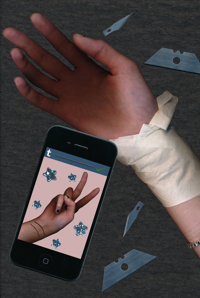
For this project, we had to use a scanner and Photoshop to create a poster that was similar to the one that we had to do for the Book of Change project, however this one was not allowed to have text. Every part of our picture had to be scanned into the computer, but they could be manipulated and combined in Photoshop to create our piece. I had little experience working with Photoshop coming into this project, so it was definitely a challenge trying to create something while trying to learn the program at the same time. I had a lot of trouble coming up with an idea and produced many failed attempts before this final piece. After exhausting new ideas and topics, I decided to go back to my original idea of making a poster against glorifying self harm. This poster hopefully brings the message across that even though self harm may look desirable or pretty online or in pictures, the reality behind the lens is nothing to be desired and is in fact a serious problem.

Blade


The things that I scanned for this piece is my own hand, a t-shirt, a phone, blades from my x-acto and box cutter, my bright green pencil case, glitter star stickers, and pages from a magazine.
After this project, I have learned that Photoshop is definitely not my preferred tool to use. The program frustrated and confused me and I don’t see myself using this again unless it is required for another project. However, I did have a lot of fun scanning things in and seeing how they turned out on the computer. It was fun scanning in objects with different textures, reflective qualities, and it was also interesting to see how things turned out if you moved the objects during the scan to create wavy and blurred effects.
Cartoon Self Portrait

This project was introduced as a practice for our final project using Adobe Illustrator. I have never used this application before so trying to get my bearings was a little frustrating and took way longer than I anticipated. But, I do have to say that this definitely forced me to learn Illustrator in a night.

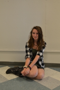
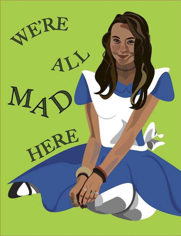
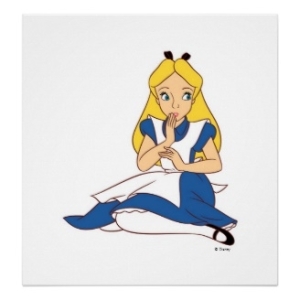
For this project, we had to pick a cartoon character, pose like them, and then cartoonify ourselves like them. I chose Alice from Alice in Wonderland! The picture of her is my inspiration and I tried my very best to pose like her:

Alice  DSC_5120

From starting Illustrator and learning it as I went along, I am very happy with how my cartoon self turned out. I worked on my face the first and I think that turned out the best in terms of matching the shadows and highlights to how they are in the original picture. However, working on my hands were the bane of my existence for two hours. Overall though, I had a lot of fun working with Illustrator and I think that it is a successful practice piece!

MAD

Diptychs

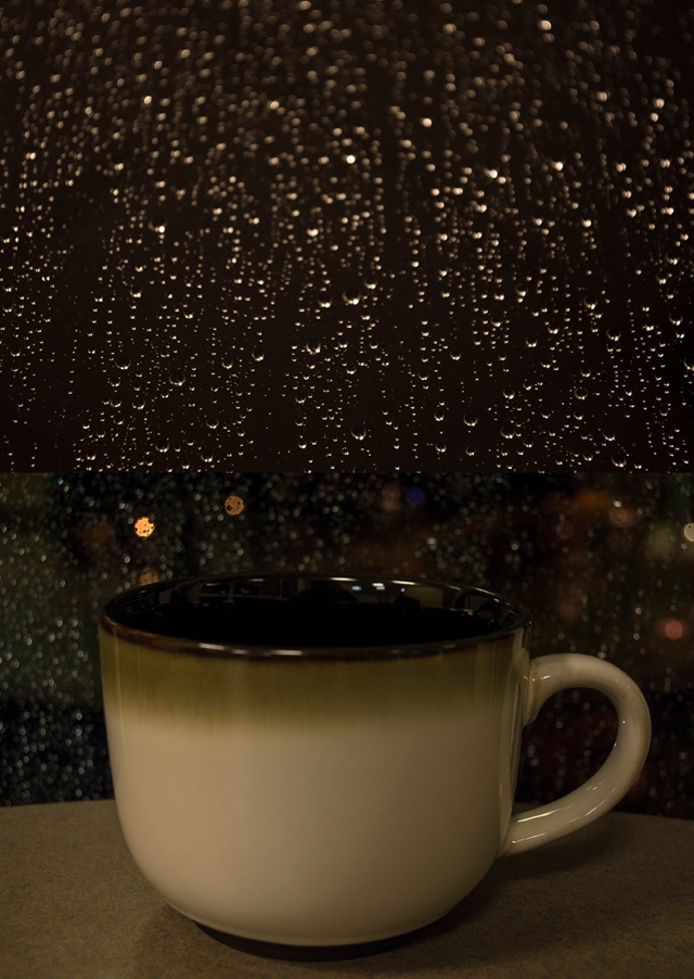
These diptychs were part of the second project I had for my digital media class. I took most of my pictures in South Campus, however I took some on a rainy night from my dorm lounge. I chose South Campus as my shooting location because I remember the beautiful garden it had and all the wonderful scenery that was down there. The shots I took of the rainy night were actually a result of boredom and experimenting with different shooting techniques while I kept warm with my cup of tea, but it turns out that I liked those results the best. I tried zooming in on individual raindrops, laying on the floor to get extreme angles of the rain racing down the window, and changing the focus to put the drops completely out of focus so that different colors showed through from the lights outside. Because these shots were mostly a result of me just playing around, I believe that my final diptych with my cup of tea and raindrops on the window is most successful piece. I paired these two images together because it looks like the rain is flowing into the cup to create an interesting effect.

A Cup of Raindrops

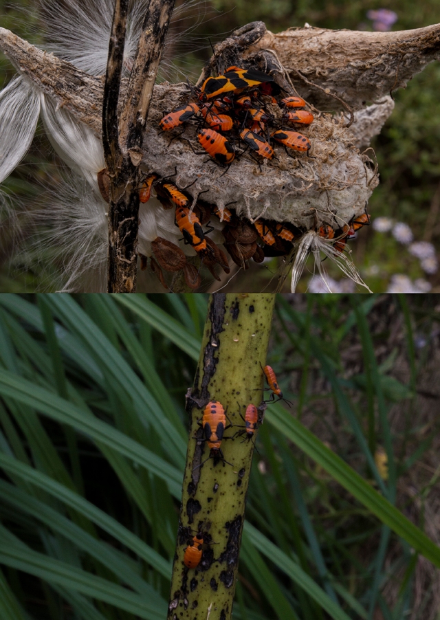
I took these pictures in South Campus in one of the garden areas. I noticed these bright orange milk bugs that made this sort of ugly plant pop with color. I zoomed into the bugs to see all the detail in their legs and little heads and I was really pleased with how clear they came out, despite how small they were. I paired these two pictures together because the consistency of the bright bugs in both photos helps connect the two even though the background is much more vibrant on the bottom picture while the top picture has a much duller background.

Milk Bugs

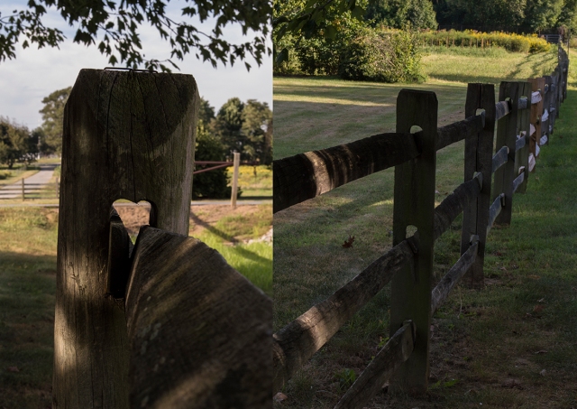
I also took these pictures in South Campus near the cornfields. I think that this is my least successful piece out of the three because I feel the color palette is a little bland. However, I do think they work together to create a functional diptych. I paired them together because I loved how the zoomed in post has a negative space that resembles a heart and I thought that it was interesting that you couldn’t see the heart shape in any of the other posts when they move away, towards the horizon.
Heart Fence

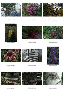
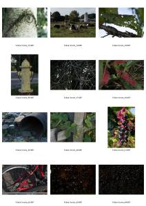
Contact Sheet of my best 24 images:

ContactSheet_FeliciaGordon._Page_1
ContactSheet_FeliciaGordon._Page_2